Complex products do not become easier to use because the interface is visually quiet. They become easier to use when the decisions behind the interface are consistent, intentional, and repeatable.
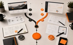
That is the real value of a UX/UI design system. It is not a sticker sheet. It is a shared language for how a product behaves.
Consistency is a business feature
When every screen solves the same problem in a different way, users have to relearn the product over and over. Teams also slow down because designers, developers, and product owners keep debating decisions that should already have a pattern.
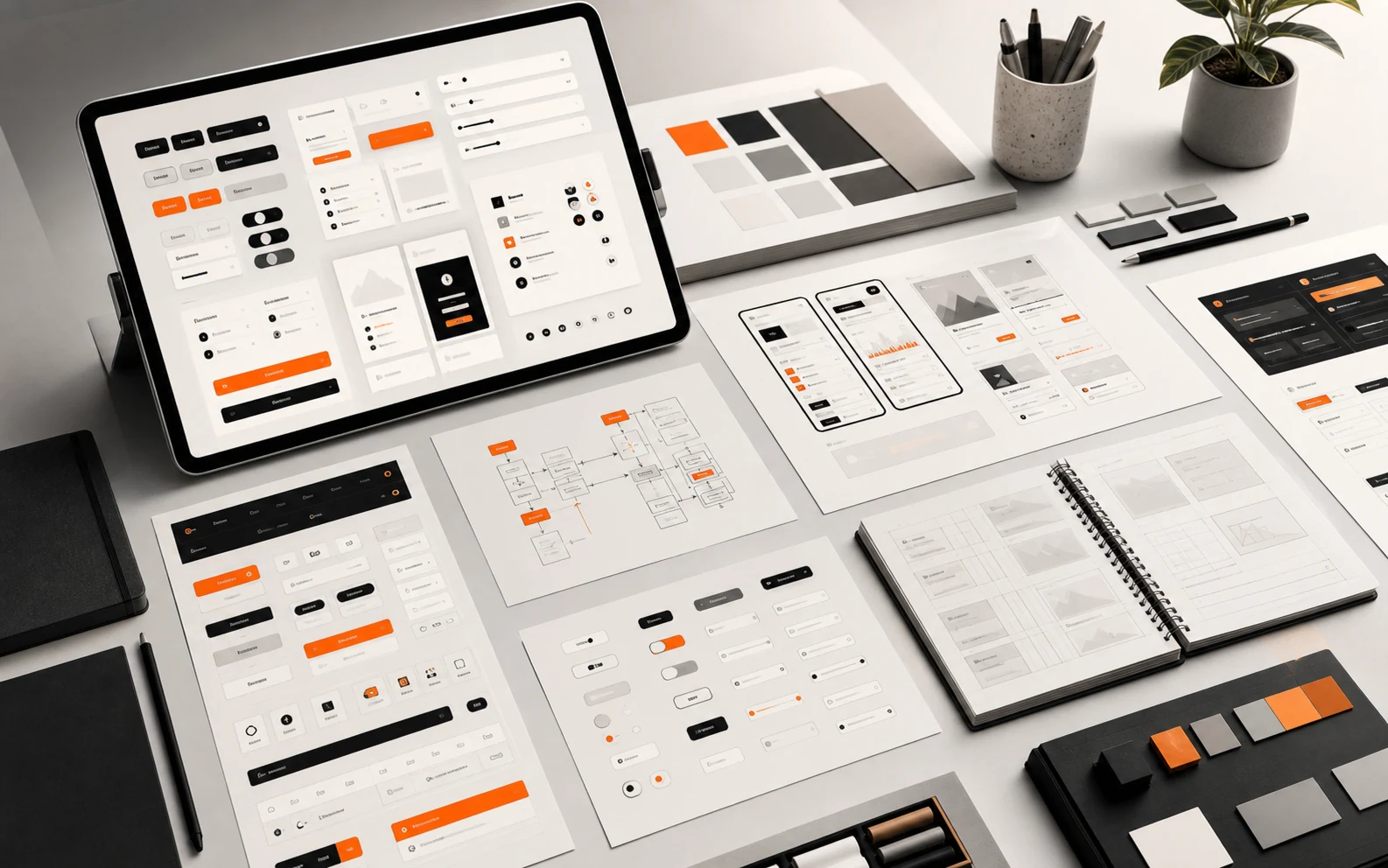
A useful design system creates consistency where consistency helps: navigation, forms, buttons, feedback states, tables, cards, empty states, error messages, and content hierarchy.
Practical nugget: A design system is working when teams stop asking “How should this look?” and start asking “What does this workflow need?”
The Nielsen Norman Group’s overview of design systems is a good primer on how shared components and standards support better user experiences. The key is not the library itself; it is the shared decision-making behind it.
A design system is a memory system
One of the least glamorous but most valuable things a design system does is remember decisions. It remembers how forms behave, how errors speak, how spacing breathes, how actions are prioritized, how empty states help, and how the brand shows up when the user is trying to get something done.
Without that memory, every new feature becomes a tiny identity crisis. Should this be a modal? A page? A drawer? A card? A button? A ghost button? A button that looks like it has unresolved feelings? Teams laugh about these debates because they are familiar, but they are expensive when repeated at scale.
The GOV.UK Design System is a good example of a public design system that treats components, patterns, accessibility, and service consistency as operational infrastructure. The lesson is not that every company needs a government-sized design system. The lesson is that reusable decisions make services easier to maintain.
Practical nugget: If a component cannot explain when to use it, when not to use it, and what problem it solves, it is not a system component yet. It is just a styled object.
Design systems should reduce cognitive load
For clients, the benefit is easier adoption and fewer support problems. For professionals, the benefit is cleaner implementation, faster product decisions, and less visual drift as the product grows.
Complex products usually have many roles, states, permissions, and exceptions. A design system helps users understand those patterns without reading a manual. If warnings, approvals, draft states, disabled actions, and completed tasks all behave consistently, the product feels less intimidating.
Accessibility belongs in the system too. If contrast, focus states, labels, keyboard behavior, and error messaging are handled pattern by pattern, accessibility becomes part of the craft instead of a late audit. The WCAG 2.2 specification is a strong external reference for this work.
The danger of beautiful inconsistency
A product can look premium in isolated screenshots and still feel chaotic in use. That happens when each screen is optimized as a composition instead of as part of a system.
Branding matters. Visual quality matters. But product interfaces also need memory. Users should recognize where they are, what they can do, what changed, and what happens next.
This is where our background in branding and development helps. A design system has to carry the brand, but it also has to be buildable. If a component looks impressive but creates unnecessary implementation complexity, it may not be the right pattern for the product.
Governance is where design systems grow up
The hard part of a design system is not making the first button. The hard part is deciding who can change the button, how those changes are reviewed, and how teams know when a pattern has become official. Governance is the quiet machinery that keeps the system from becoming either a museum or a junk drawer.
For clients, governance can sound like bureaucracy. In practice, it is what protects the product from drifting every time a new campaign, feature, or stakeholder arrives. For professionals, it creates a healthier way to evolve patterns without pretending that every edge case deserves a brand-new visual language.
A good rule is to let the system be strict about fundamentals and flexible about context. Typography, spacing, accessibility, color roles, and interaction feedback should be stable. Product-specific compositions can breathe more. That balance keeps the system useful instead of authoritarian.
Start smaller than you think
Teams do not need to define a massive system before improving consistency. Start with the highest-use patterns: typography, color roles, spacing, buttons, forms, cards, navigation, and feedback states. Then connect those patterns to real product flows.
Related Absolutmedia reading: Website Redesign vs Web App Build and Digital Product Strategy.
How Absolutmedia approaches it
We build UX/UI systems from the product’s real use cases. The goal is not to create a decorative library. The goal is to make complex workflows easier to understand, easier to build, and easier to improve without losing the brand.
Next step
If your product feels harder to use every time it grows, audit the repeated patterns first. Then bring those patterns into a structured conversation through Absolutmedia’s services or the process.